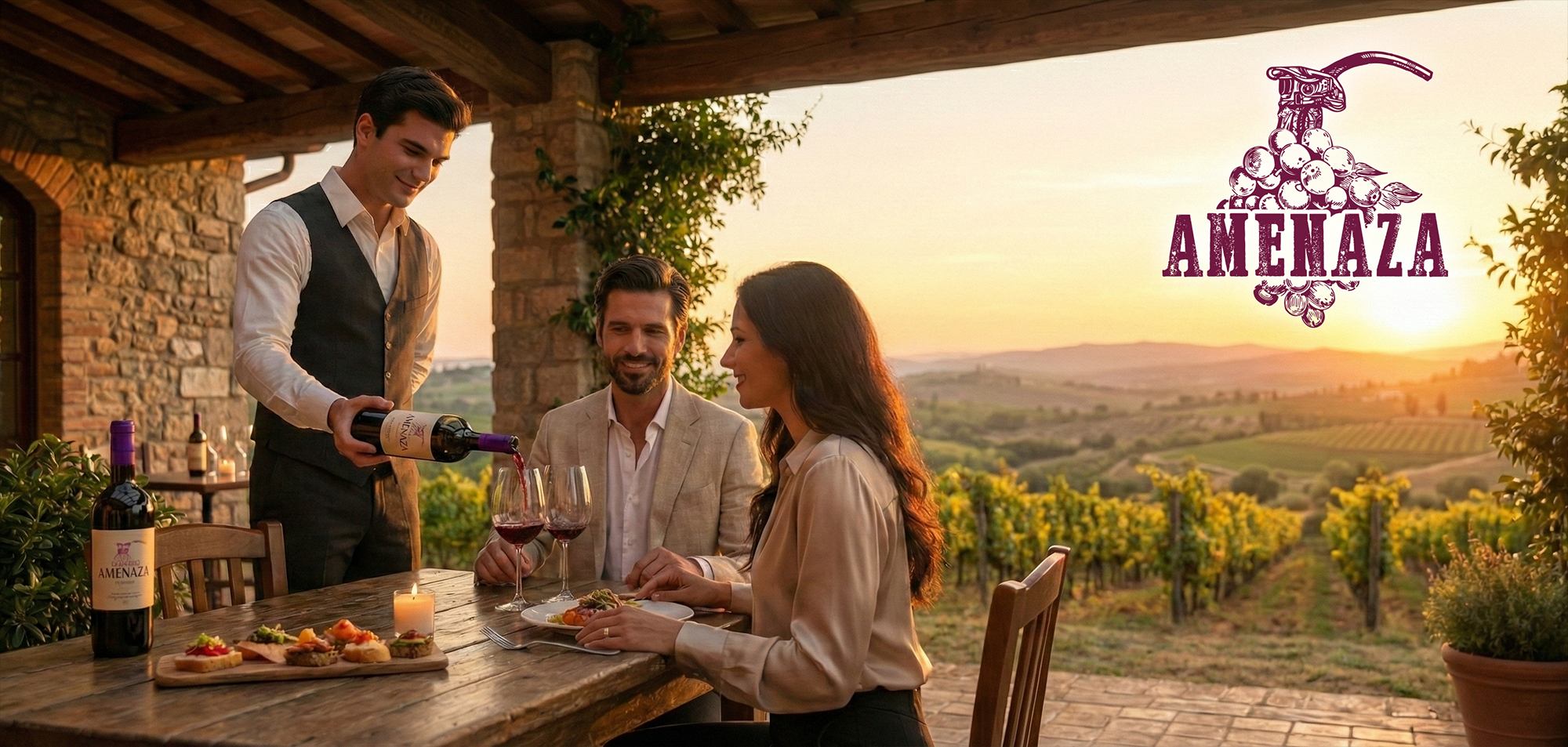
01. Branding Strategy
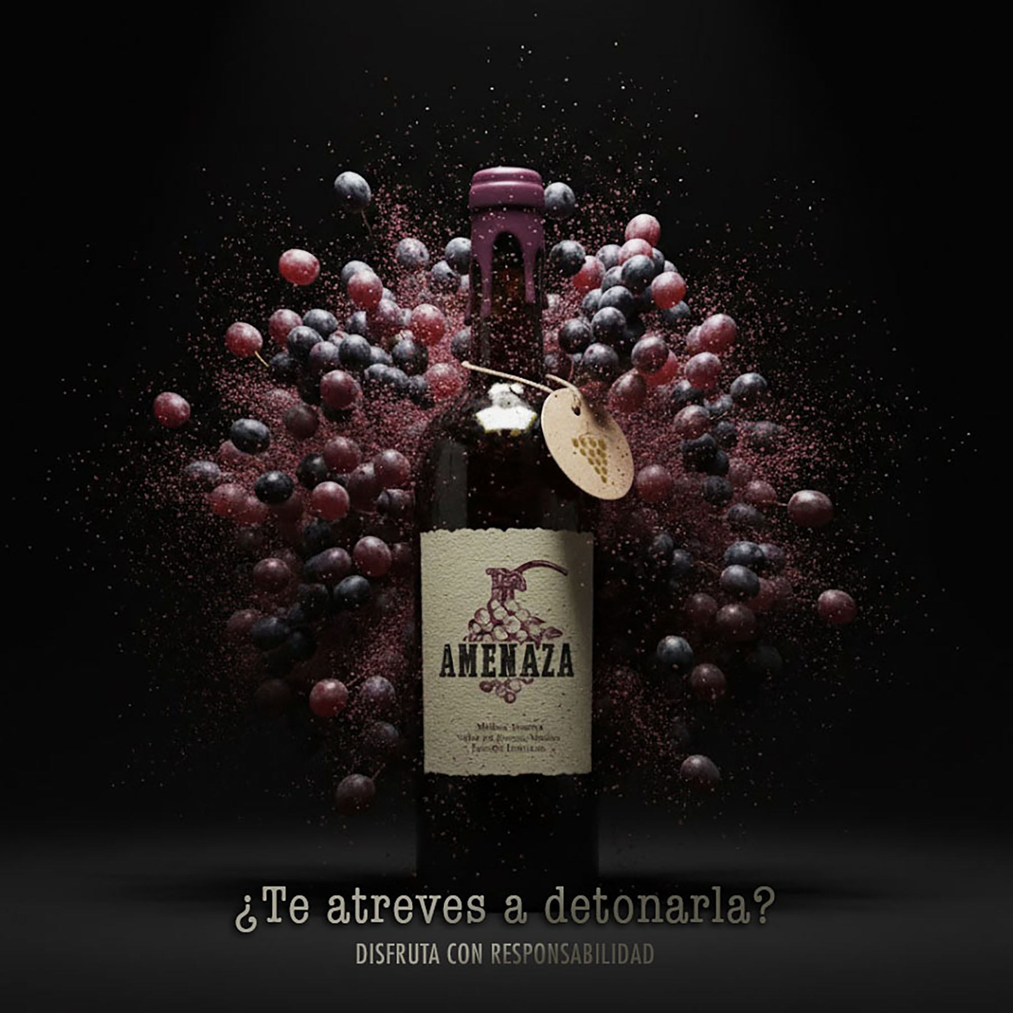
The strategy for Amenaza revolves around the concept of "Dangerous Elegance," positioning this Malbec as a disruptive force within the wine industry. By moving away from traditional vineyard aesthetics, the brand embraces a narrative of intensity and anticipation, targeting a bold audience that values sophisticated rebellion. This approach frames each bottle as an explosive sensory experience, where the act of uncorking becomes a countdown to a high impact discovery.
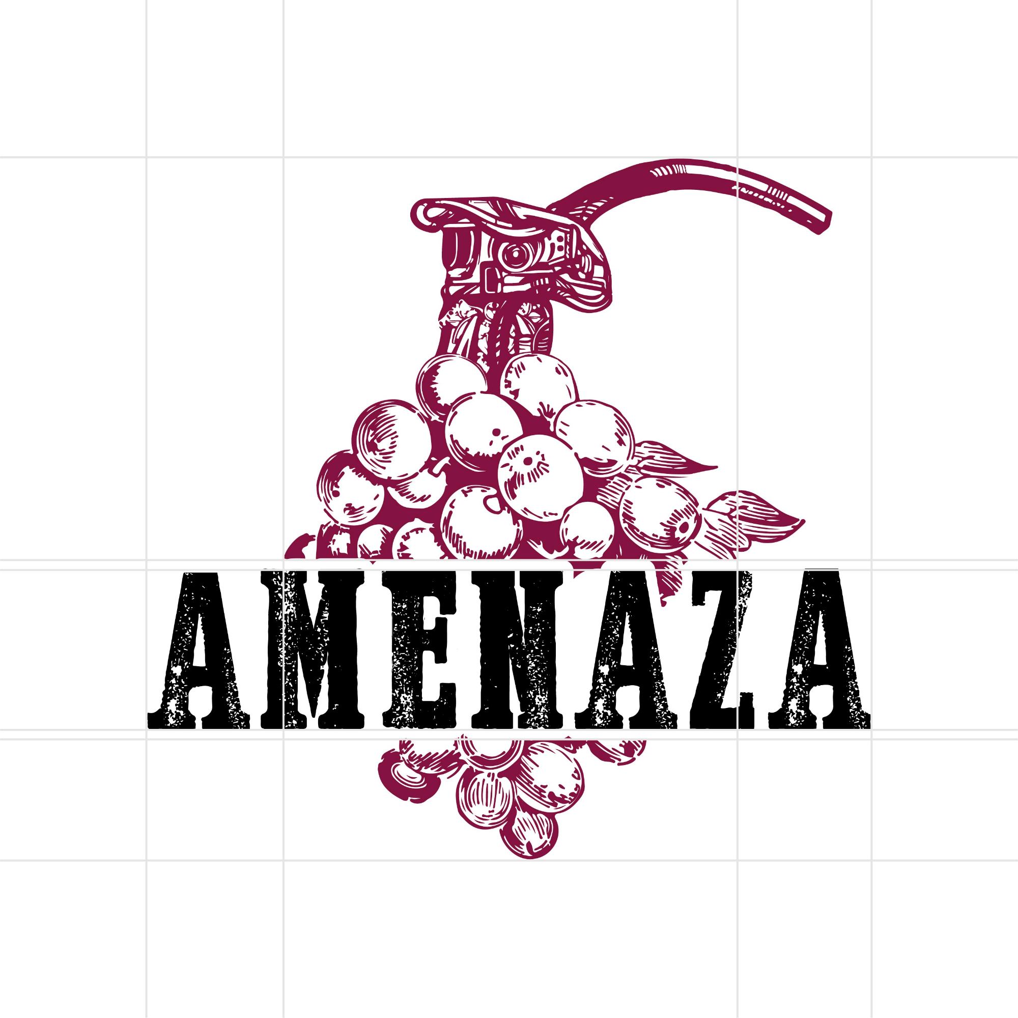
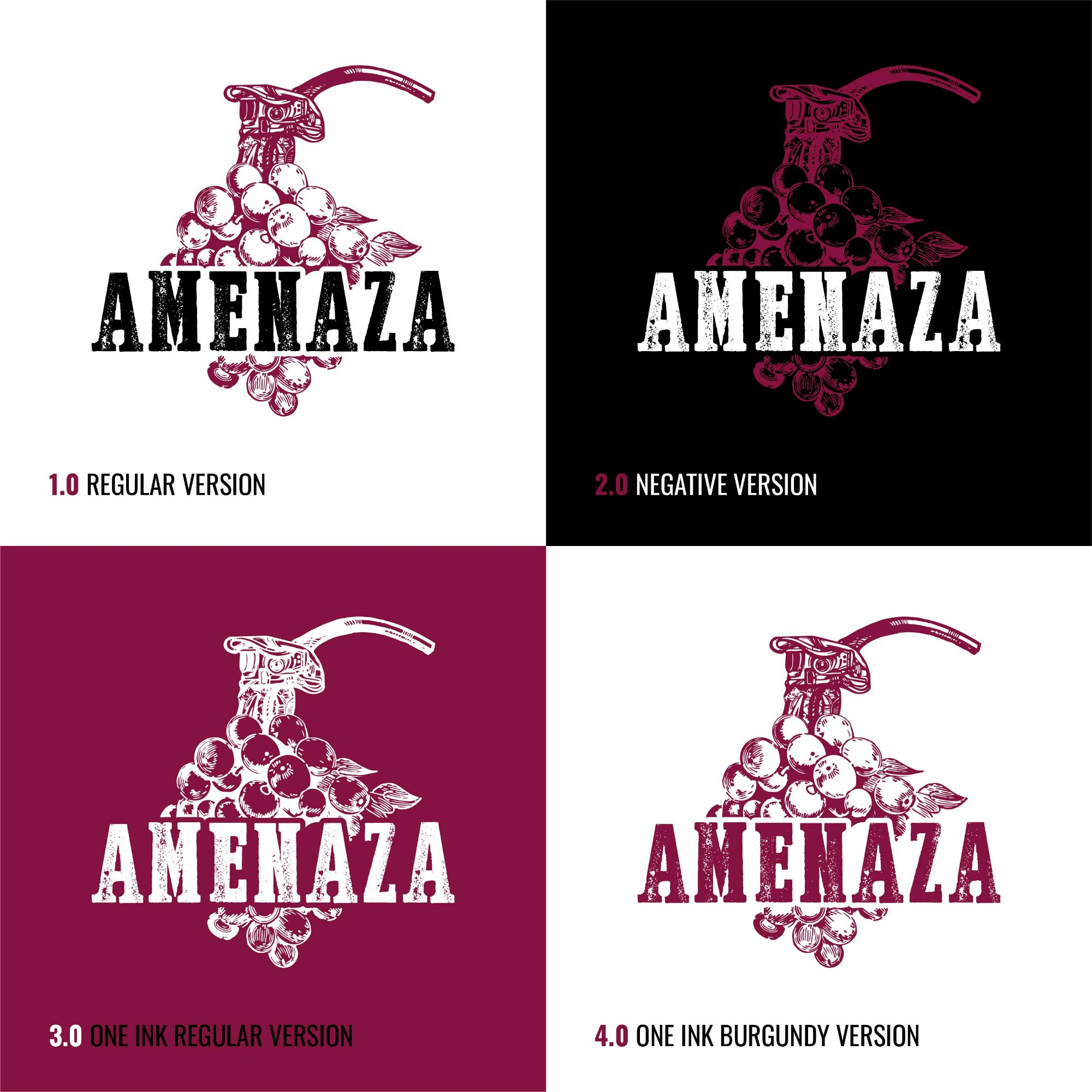
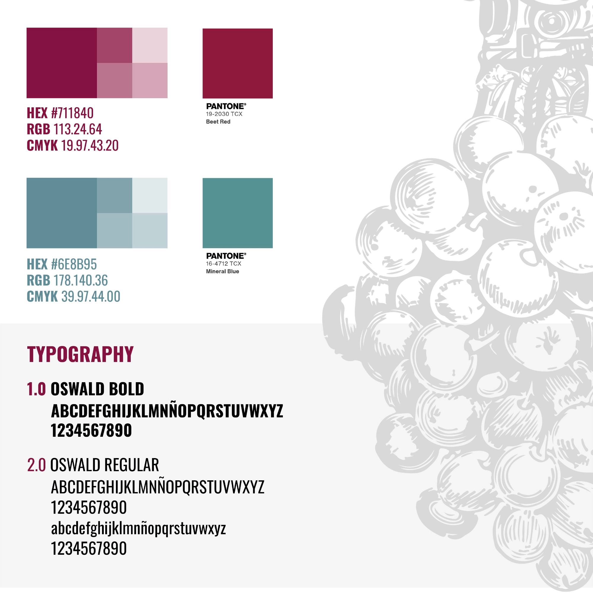
02. Visual Identity Design
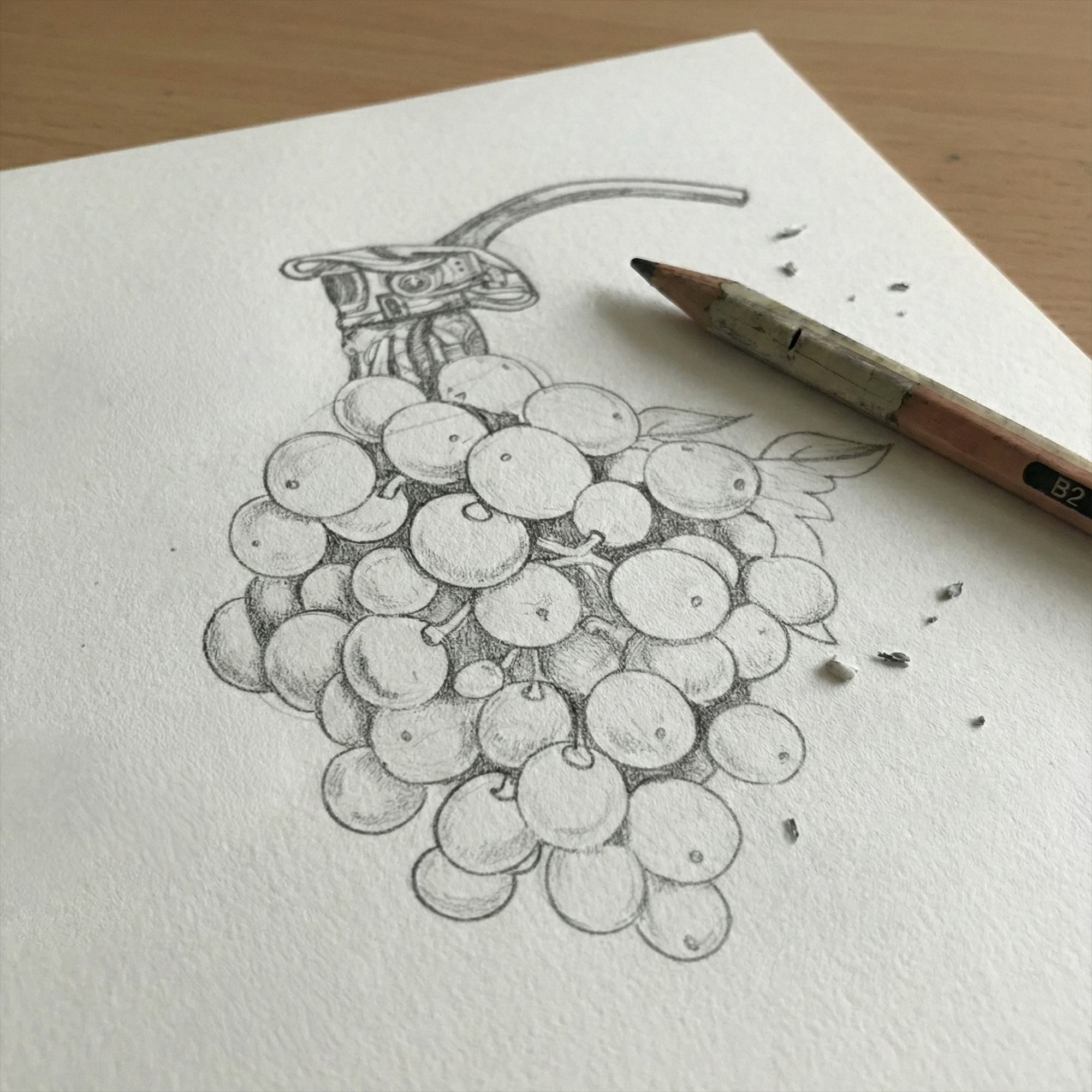
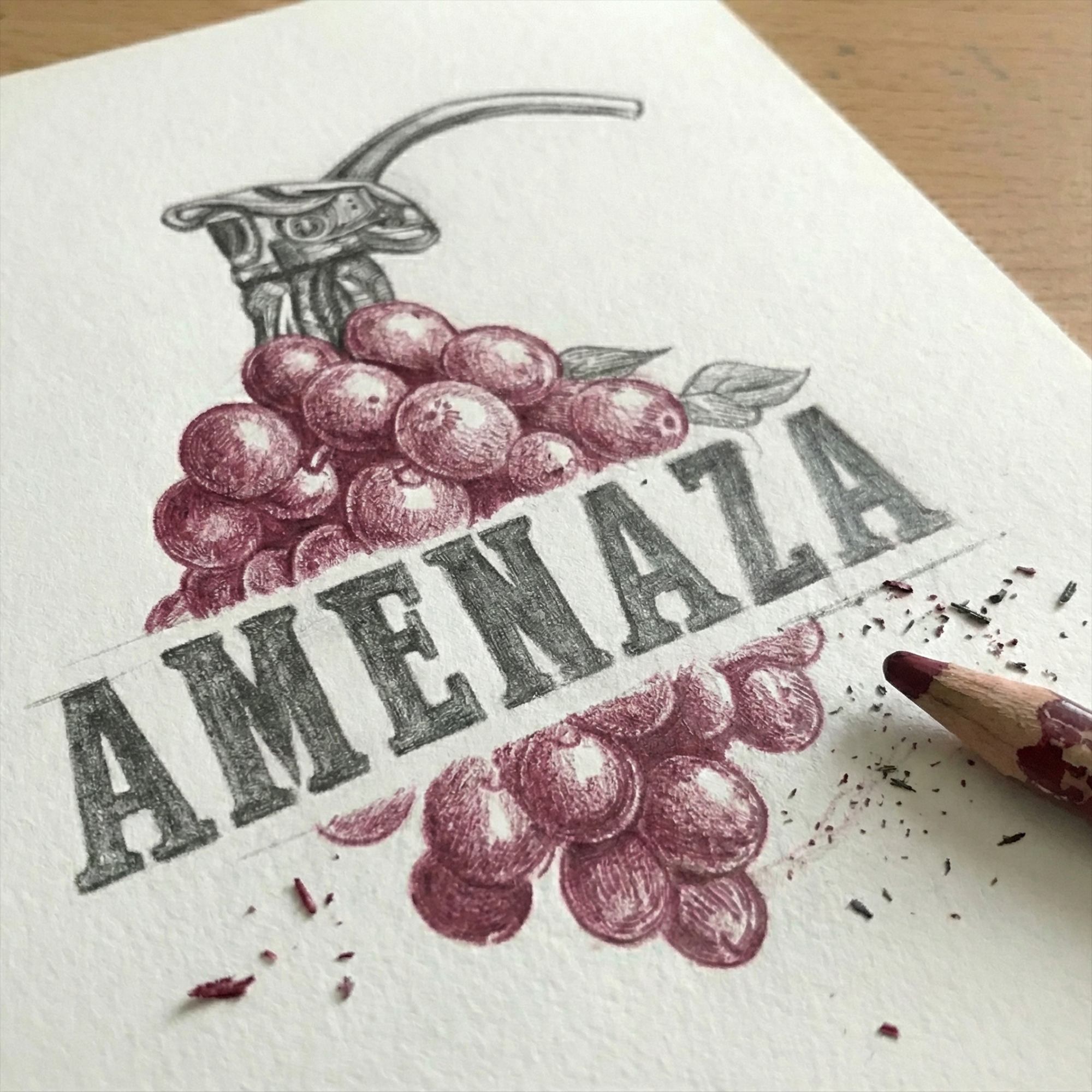
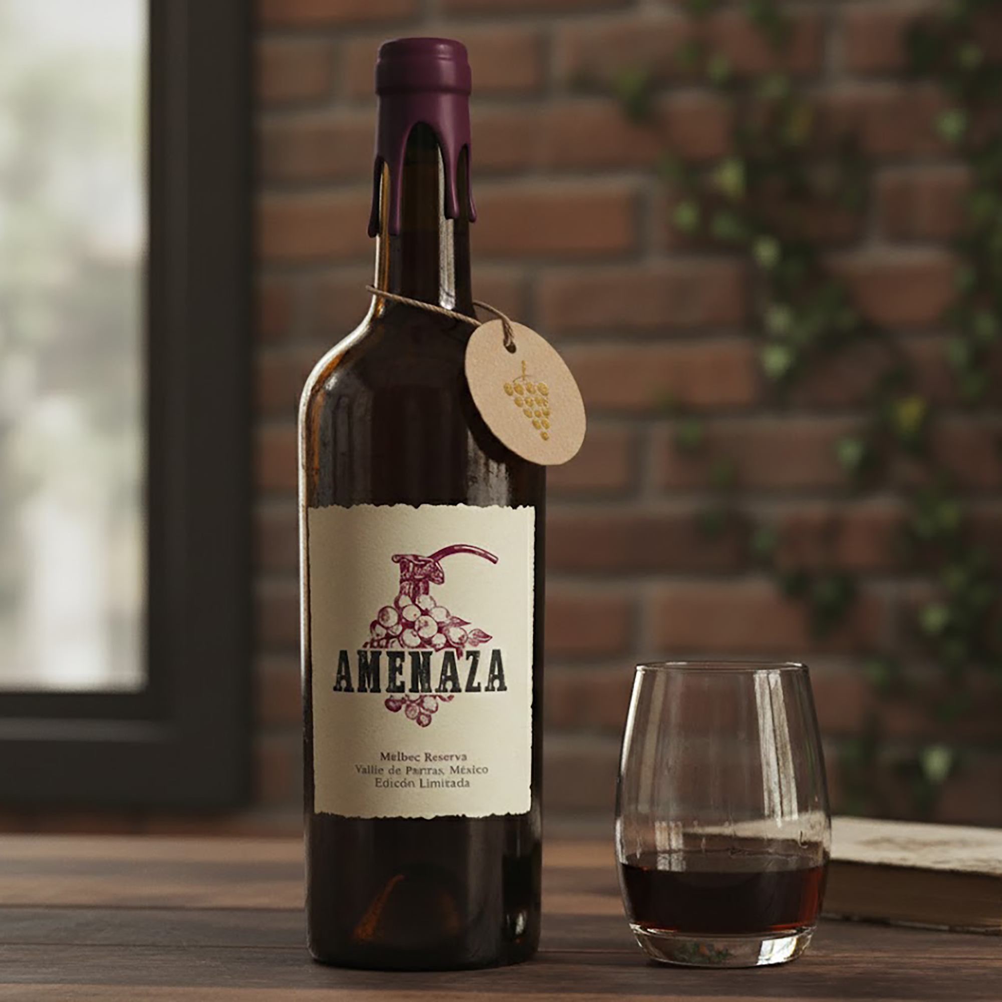
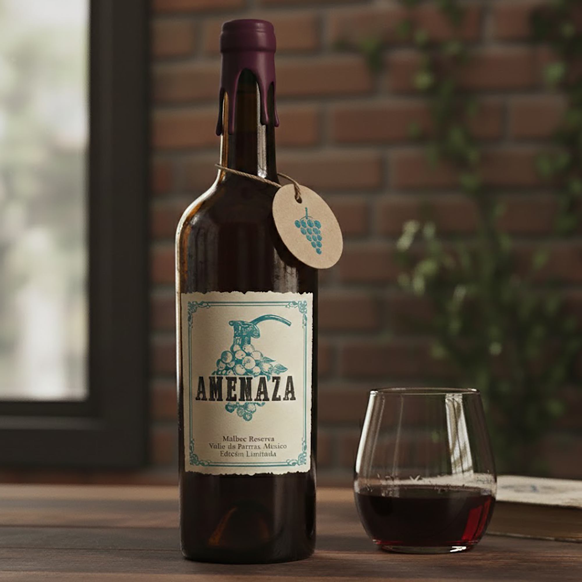
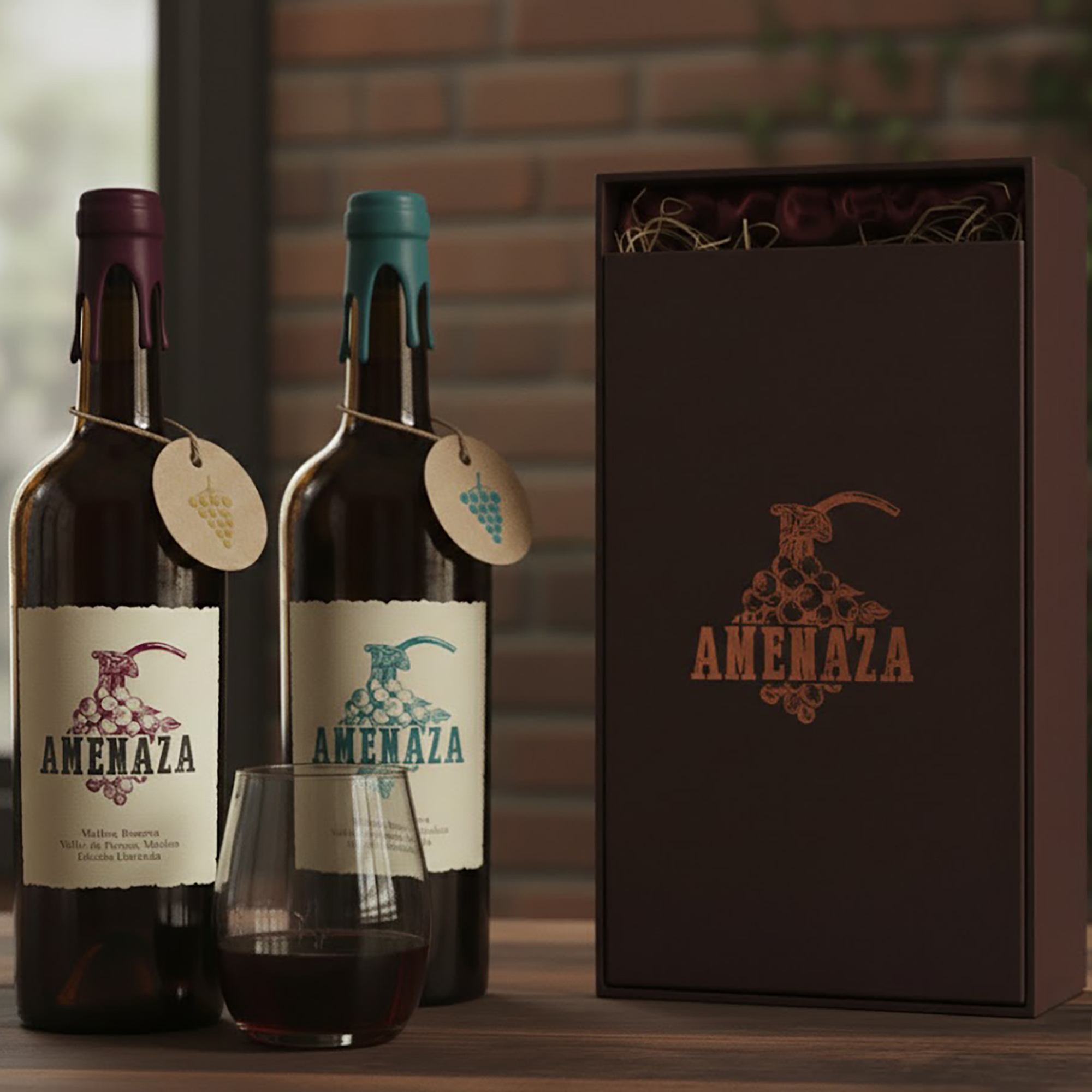
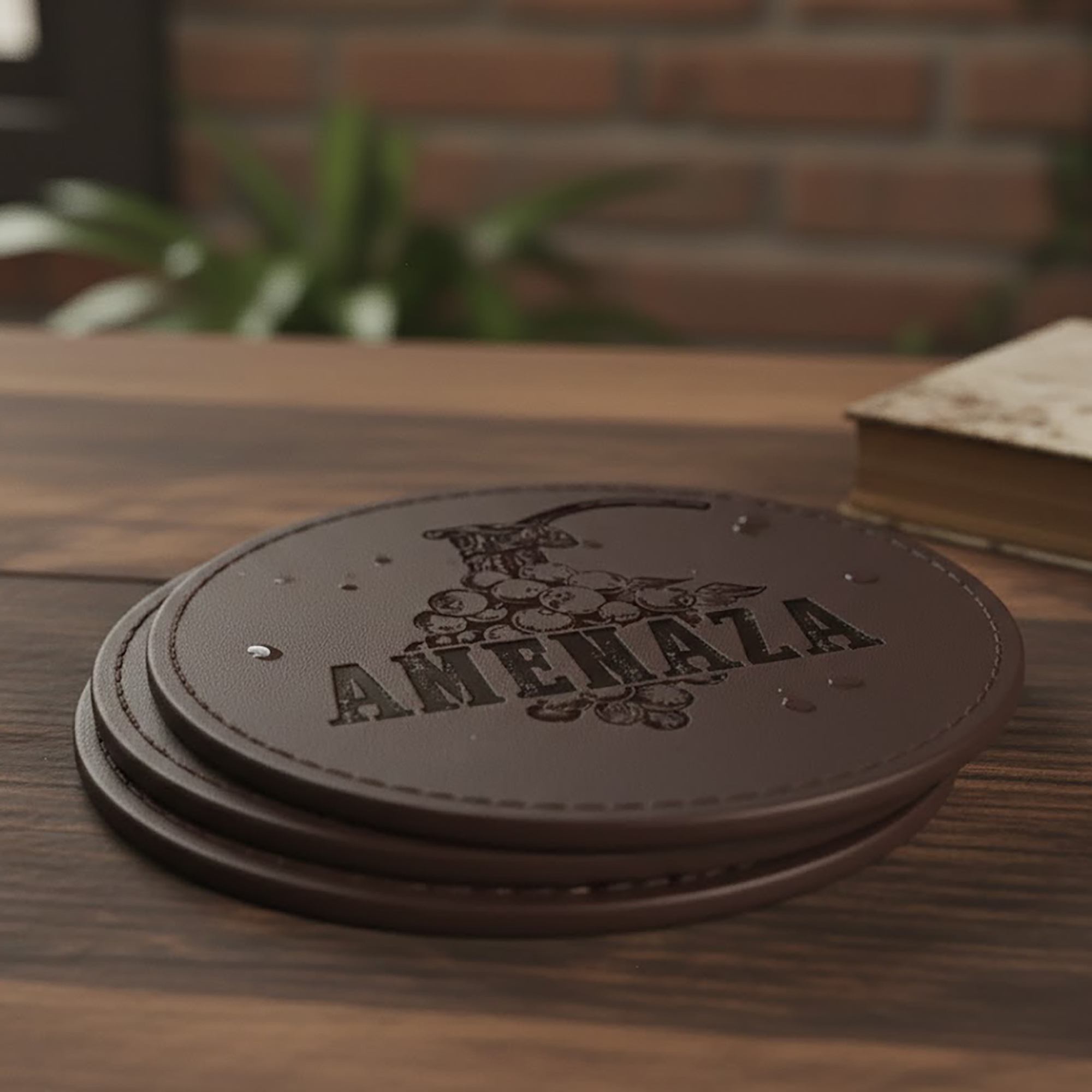
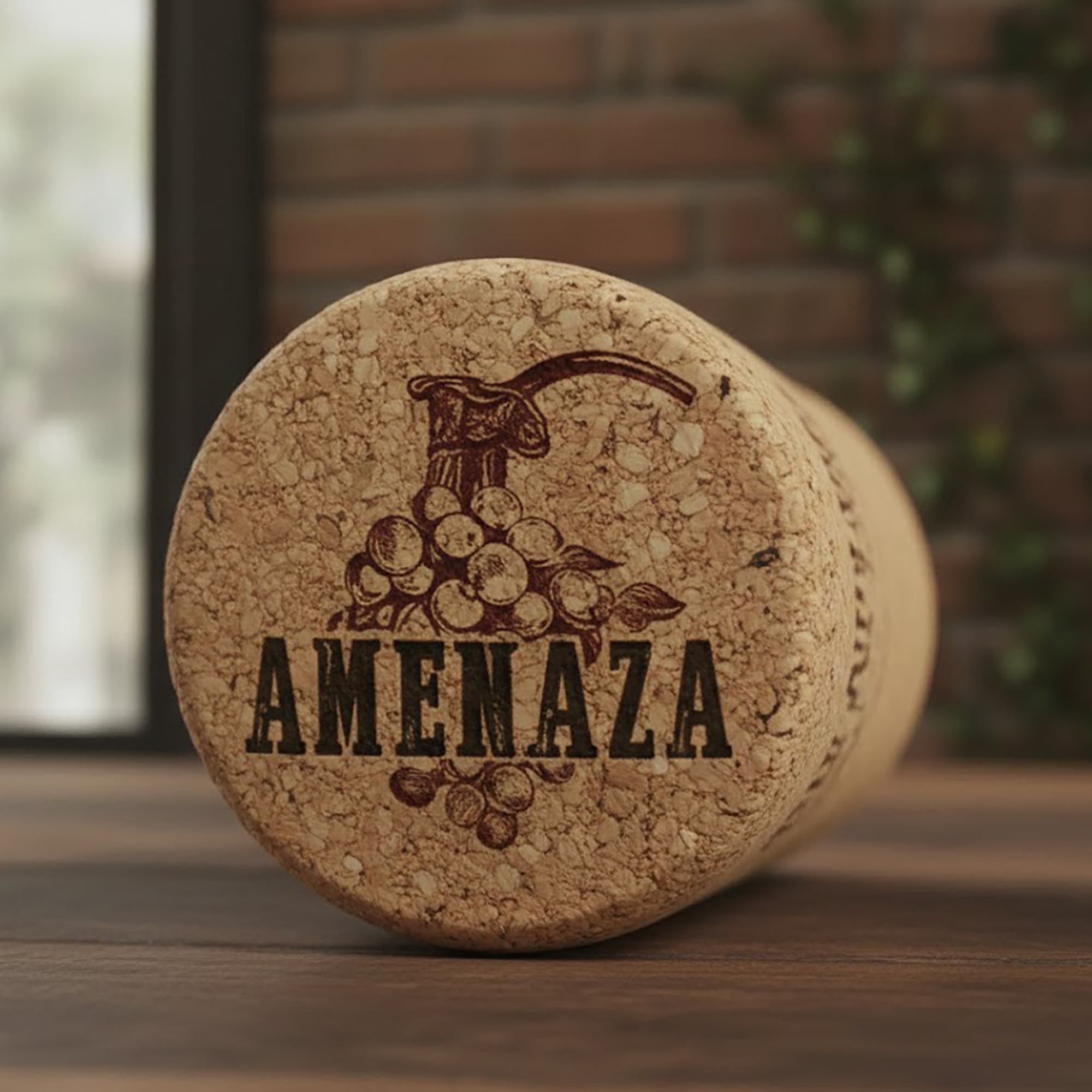
The visual identity is anchored by a hand drawn illustration that masterfully fuses the organic form of a grape cluster with the mechanical precision of a grenade detonator. Utilizing a rustic hatching technique and a distressed, heavy slab serif typeface, the logo conveys a sense of weight and authority. The minimalist color palette, featuring a deep Malbec burgundy, reinforces the artisanal nature of the product while highlighting the "lever" as a primary disruptor that transforms a traditional icon into an object of action.
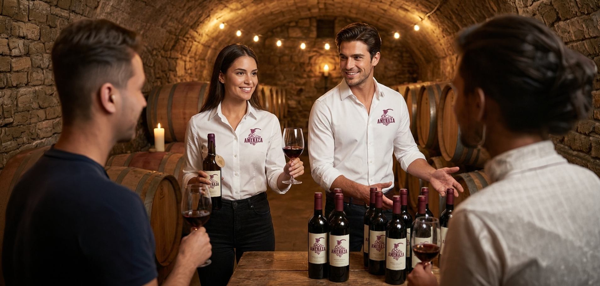
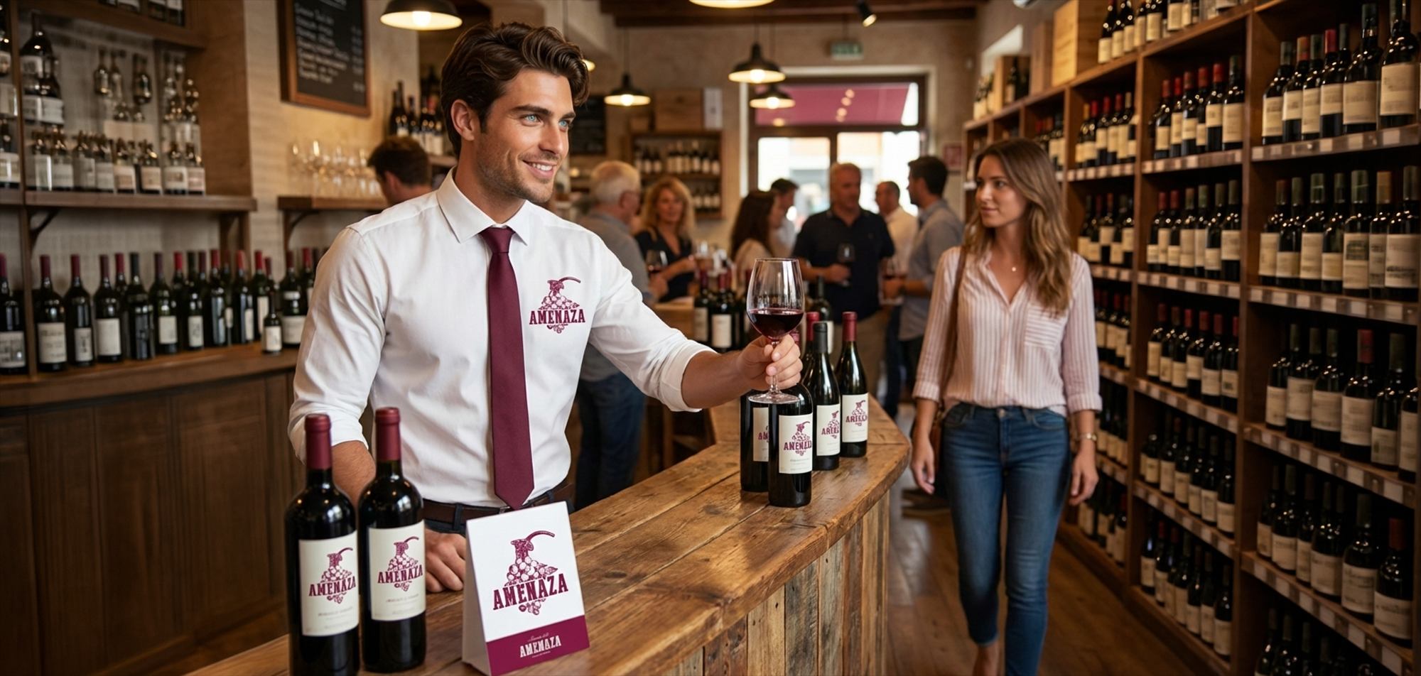
03. Deliverables
This project was executed through a series of high impact touch points, including a comprehensive branding strategy, a complete graphic identity system, and conceptual publicity proposals. Key deliverables focused on specialized labeling, textured hang tags, and graphic applications that emphasize the brand’s rustic roots. Additionally, a curated set of social media assets was developed to maintain the brand’s high tension narrative across digital platforms, ensuring a consistent and provocative presence.