01. Branding Strategy
The naming strategy for LAND CLUB was centered on establishing a definitive territory for radical self-expression within Mexico City’s nightlife scene. The name itself was designed to evoke a sense of place that exists outside traditional boundaries a dedicated sanctuary where rules are suspended and uncompromising originality is the standard. By positioning the brand as a living manifesto for the unconventional, the strategy successfully created a unique narrative for a venue that promised otherworldly themes and an atmosphere where every guest truly belonged.
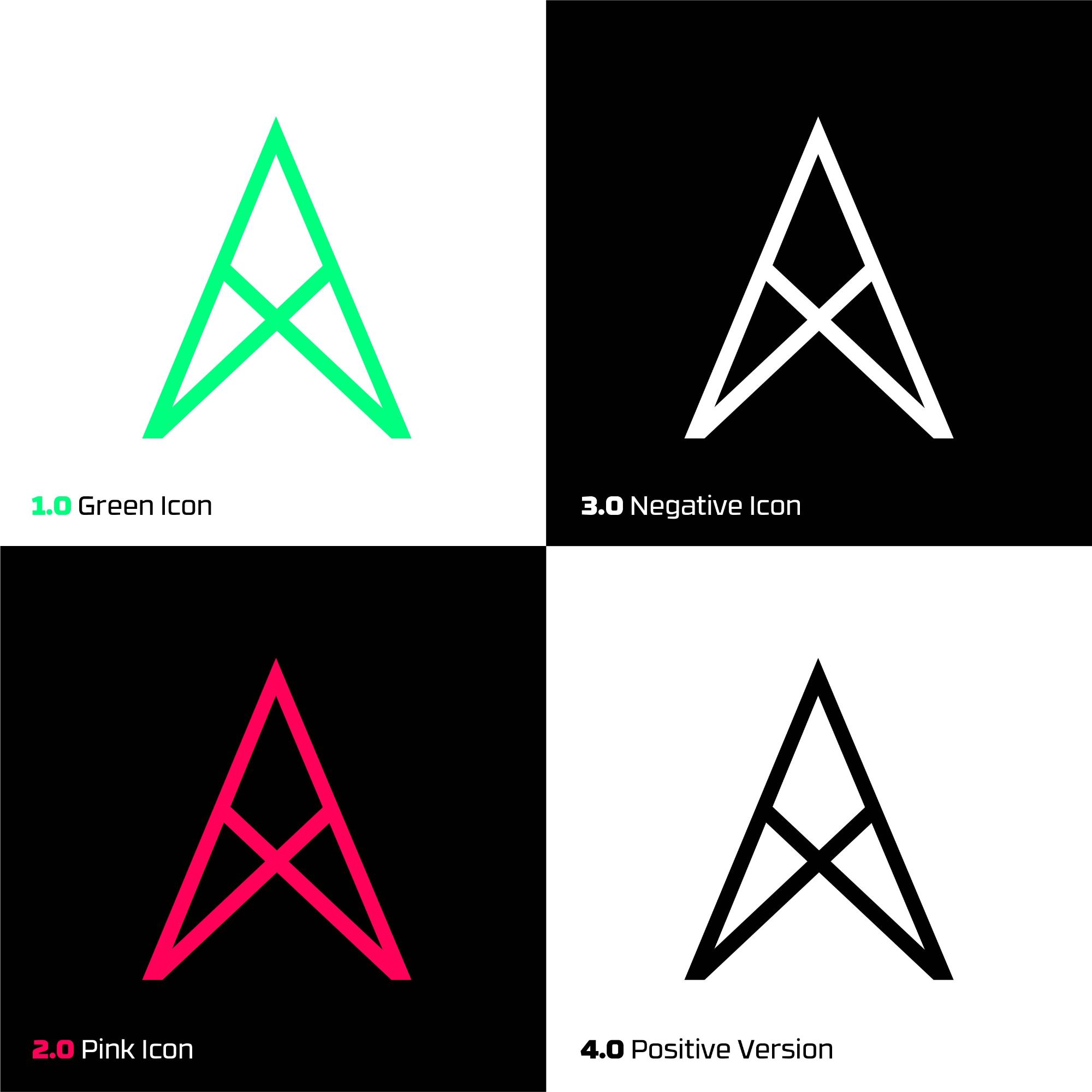
02. Visual Identity Design
The visual identity design translates the club's defiant spirit into a system defined by "functional rebellion," anchored by a transformative custom logotype. The design subverts standard typography, turning the letter 'A' into an upward pointing arrow to symbolize elevating the nightlife experience above the mundane and directing energy toward a higher state of expression. Complementing this, the 'D' is reinterpreted as a rotated smiley face, embedding a coded signal of unconventional euphoria and radical belonging directly into the brand name. This daring integration of symbols within text establishes the surreal visual language that defines LAND.
03. Deliverables
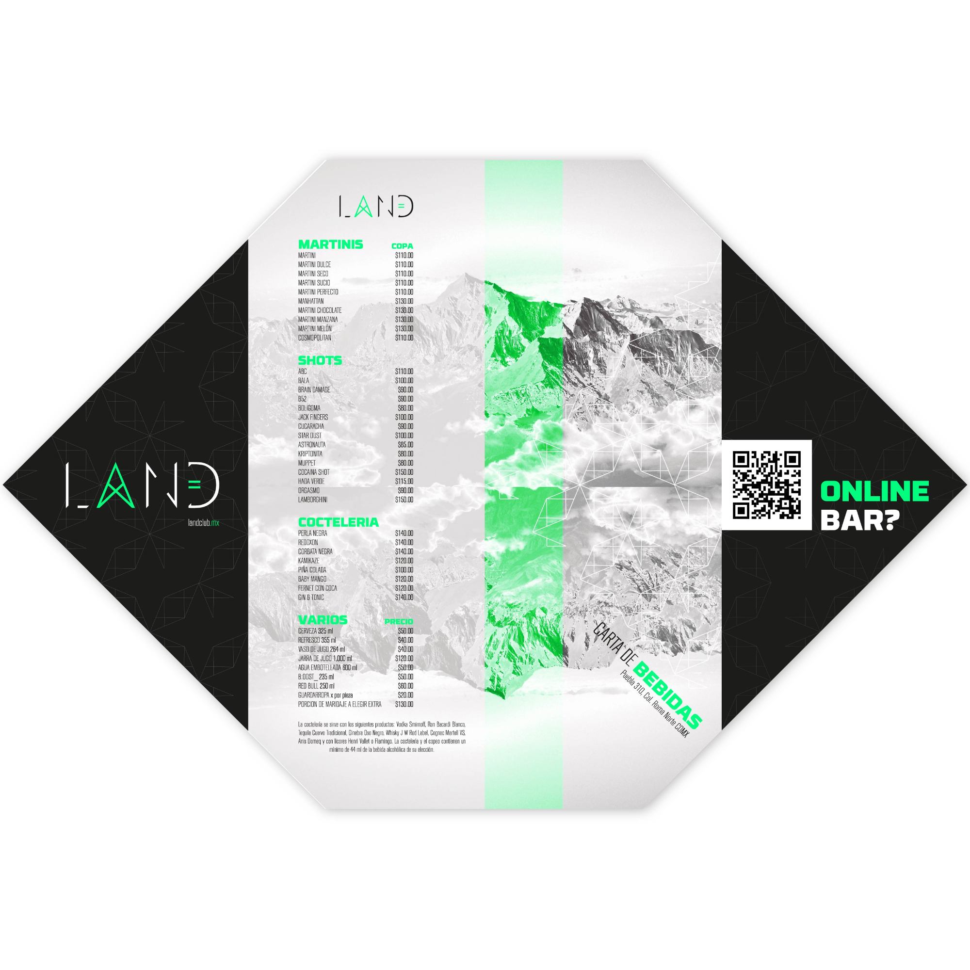
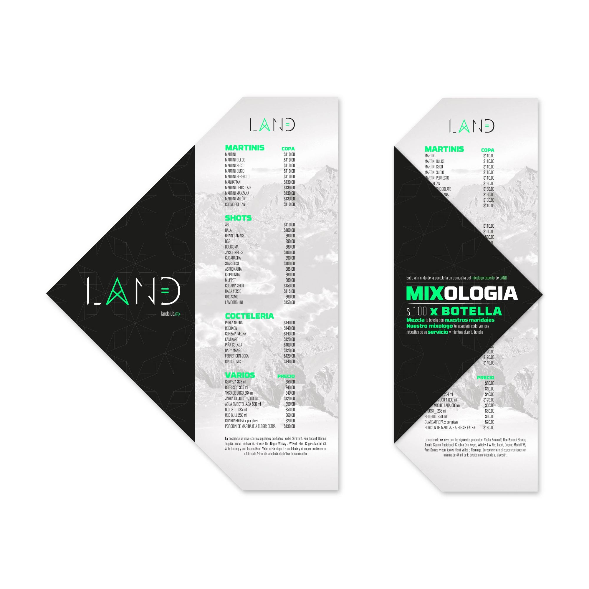
The project scope encompassed a comprehensive suite of strategic and creative deliverables that built a robust brand ecosystem. This began with the core graphic identity and brand naming strategy, followed by the development of a digital ecosystem and a targeted social media strategy designed to engage a niche, radical audience. The final phase included the design of all corporate stationery and various graphic applications, ranging from innovative posters and merchandise to environmental installations that solidified LAND’s identity across all physical and digital touchpoints.